ShopDreamUp AI ArtDreamUp
Deviation Actions


Suggested Collections


You Might Like…


Description
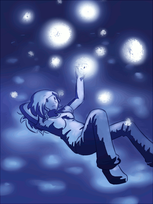
Was listening to Owl City's Fuzzy Blue Lights, and wanted to practice lighting and perspective.
Then I had the idea that I'd animate it ._.
....*twitch* |D
Could be better, I know... any suggestions from anyone?
Then I had the idea that I'd animate it ._.
....*twitch* |D
Could be better, I know... any suggestions from anyone?
Image size
600x800px 5.31 MB
© 2011 - 2024 Fuzzlespup
Comments41
Join the community to add your comment. Already a deviant? Log In
Ooh at first i didn't even realise this was an animation (my internet is a bit slow, so it took a while for it to load |D). I quite like how you put the extra effort into animating the pic which makes it feel more "alive" this also explains why there's colour artefacts...gifs and their 256 colour limit lol
One way is which you could make the animation better would be to have the fuzzy blue lights glow alternatively. Right now you've got them glowing all in sync with each other which gives them a "fake" look. By choosing a couple of random lights and then having them dim whilst the others glow (and vice versa) it will make them look more natural (think of stars!)
In terms of your actual image, i like the way you drew the reclining pose <img src="e.deviantart.net/emoticons/s/s…" width="15" height="15" alt="
The shadows on your character also seem very "controlled" because we can see the darker lineart around them, which similarly doesn't blend well with the rest of the colouring in your image, which is somewhat softer. If you either get rid of the lineart on the shadows or make them the same colour as the shadows then this would make the colouring seem more cohesive.
If you were intending on the ground she's lying on to be glowing rock or something then perhaps putting in some rock like definition (ie small stones, ground cracks, mini crevasses etc) would convey this better <img src="e.deviantart.net/emoticons/s/s…" width="15" height="15" alt="
And now ratings yay
Vision: 3 stars, it goes quite well with the song which shows clear correlation between it and your inspiration.
Originality: 2.5 stars, i can't say that glowing things are hugely original but i do like your take on it C:
Technique: 3.5 stars, your drawing looks nice and seems in proportion for the cartoon/anime style it's drawn in. Also the extra mile in attempting to animate it (and doing it smoothly!) was a nice touch.
Impact: 3 stars, it's nice and serene.